Tor Project – Anonymity Online
The Tor network is a group of volunteer-operated servers that allows people to improve their privacy and security on the Internet. Tor’s users employ this network by connecting through a series of virtual tunnels rather than making a direct connection, thus allowing both organizations and individuals to share information over public networks without compromising their privacy. Along the same line, Tor is an effective censorship circumvention tool, allowing its users to reach otherwise blocked destinations or content
OrganizationThe Tor ProjectYear2019Websitewww.torproject.org
Tor Project Mission
“To advance human rights and freedoms by creating and deploying free and open source anonymity and privacy technologies, supporting their unrestricted availability and use, and furthering their scientific and popular understanding”
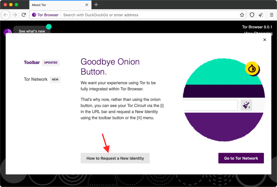
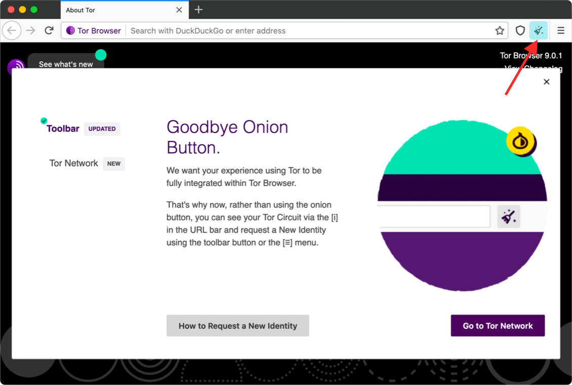
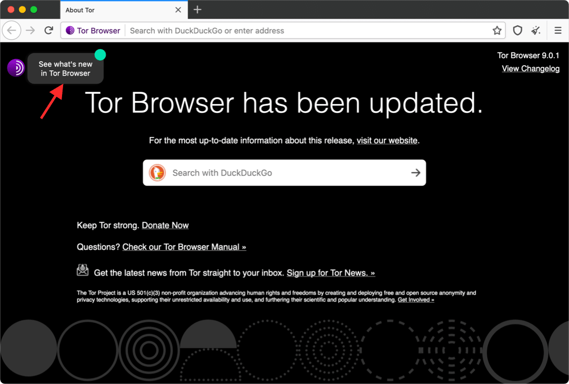
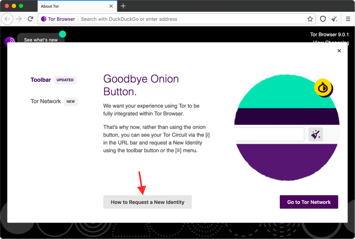
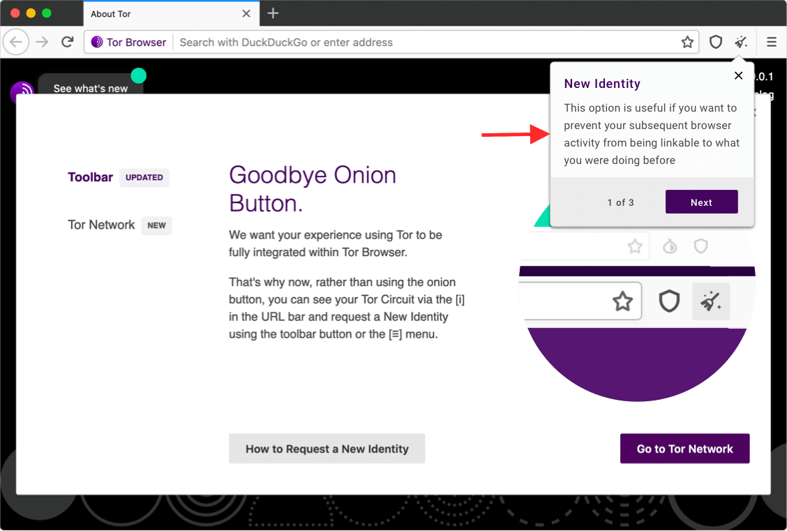
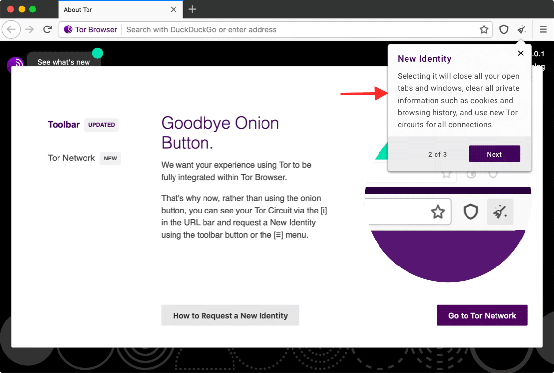
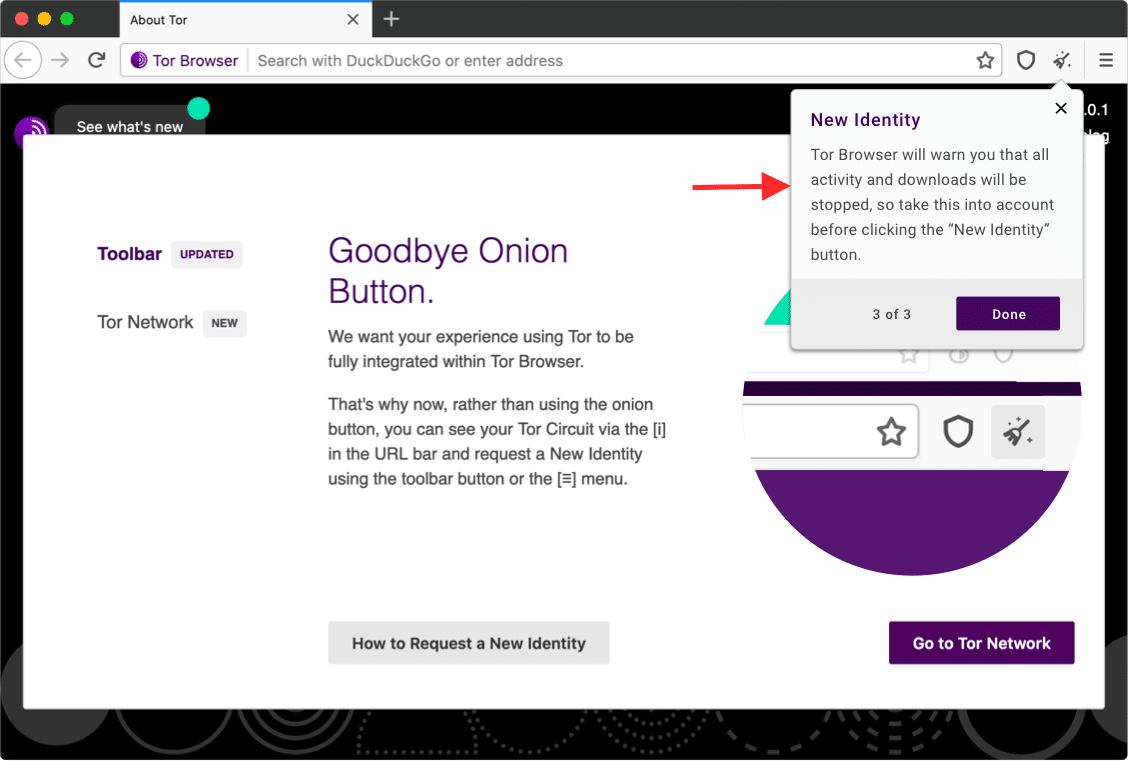
Task: Onboarding “Goodbye Onion Button”
“The “How to Request a New Identity” button seems to register the click and release, but not do anything obvious. Only after a while did I notice that the “broom” icon seemed to be outlined in pale turquoise and pulsing. (on macOS 10.12.6; on Linux it seems to be a slightly more visible pale turquoise with a non-pulsating but more visible turquoise border)”
Current Flow
As mentioned above, with the introduction of the new way to request a new identity, the design only highlighted the button with a simple pulsing outline, which was easy to miss. See flow bellow.

Proposed Flow
Looking at the current flow, we could really improve the way we introduce this new feature, so its easier to understand and at the same give a bit more information to the users, so they are better informed to make their decision.

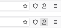
Task: “New Identity” icons are ambiguous
On upgrading to 9.0a8, I had trouble identifying what the new “New Identity” button was supposed to represent. I can’t tell if it’s supposed to be a broom with sparkles around it, or a rocket in flight against a starfield.
Current Icon

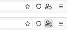
Proposed - Option 1
Proposed - Option 2
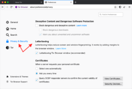
Task: Allow Letterboxing opt-in/out
Tor Browser, in its default mode, is starting with a content window rounded to a multiple of 200px x 100px to prevent fingerprinting the screen dimensions. The strategy here is to put all users in a couple of buckets to make it harder to single them out. That worked until users started to resize their windows (e.g. by maximizing them or going into fullscreen mode). Tor Browser 9 ships with a fingerprinting defense for those scenarios as well, which is called Letterboxing, a technique developed by Mozilla and presented earlier this year. It works by adding white margins to a browser window so that the window is as close as possible to the desired size while users are still in a couple of screen size buckets that prevent singling them out with the help of screen dimensions.

Proposed Solution
Currently the letterboxing opt-in button is located in about:config, which is a fairly technical area and where normal users shouldn’t be tinkering with. So it was best to bring the opt-in functionality to the Tor browser settings, under Security & Privacy.
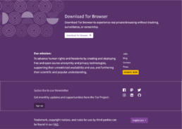
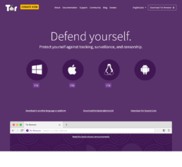
Task: Improve Download Page
We just had a user in #tor who was trying to download the Windows version of Tor from our website, but it wasn’t downloading.
After much debugging, we discovered that they had clicked on “download” from our front page, and ended up at https://www.torproject.org/download/ and then waited for the download to begin.
They didn’t realize that they needed to scroll down, look for the windows icon, and click on it. Pastly says he has talked to a half dozen other users in the past few weeks who reported the same “download doesn’t work” issue.
It would seem that we should improve the UX of our download page so it is more clear that you need to click on one of the pictures.
I also theorize that the big donate banner on the top of the page is adding to the confusing flow of the page — maybe people are used to seeing a banner like that on a page that has already auto triggered a download.
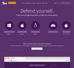
Section 1 “Download” - Before and After
The download buttn in the current version isn’t clear enought (circle with the logo) and bellow we have the signature so users can verify their download hasn’t been tampered with, but this is fairly technical and hasn’t been explained, introduced or why users should do it, so in my proposal I also tried to make this a bit more informational so users are better equipped to make a decision.
Current
Proposed
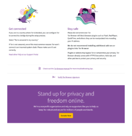
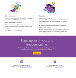
Section 2 “Information” - Before and After
This section only had small re-arrangements. Since we introduced the signature verification more contextually above, there was no point to included it in here anymore, so it was a better to add a link to Support and FAQs, right next to the Tor browser manual.
Current
Proposed
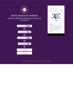
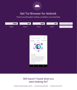
Section 3 “Download Android” - Before and After
This sections was optimized for mobile, btu was quite disjoined and confusing if we compared it to the top download section. My approach here was to try and bring some consistency to it, and improve its flow, by pointing the use to other sources if by this stage they haven’t found the download option they were looking for.
Current
Proposed
Section 3 “Footer”
This section was common across the whole Tor project website, and its actually good already ,so no improvements were proposed to it.